It is fair to say the most widely used analytics tool is Excel. The ease of use and its ability to impart data in a clean, concise manner will always be appealing. But all of us have experienced some form of manual task or labor-intensive activity that detracts from Excel’s appeal when building a report. Issues include slow refresh times, row limitations, corrupt workbooks, complex/error prone formulas, limited features of charts, and so on. Often, moving away from “Excel Hell” is the initial challenge we are faced with across our clients, and that challenge persists across almost every business function of an organization.
[sch_pullbox]  But what if you could take these labor-intensive tasks from Excel and convert it to easily refreshable, beautifully rendered reports? Look no further than Power BI!
[/sch_pullbox]
We have routinely found that Power BI, while an extremely powerful tool for enterprise analytics and business intelligence reporting, is also an excellent tool to automate Excel based processes and start moving toward what we deem “Entry Analytics.” Since Power BI is easily enabled through an Office 365 subscription and readily available to most small to mid-size organizations, it can be a valuable solution often overlooked for Excel-based process automation. If you’re interested to see the how this concept is put into practicality, check out the use case outlined below, where we put “Entry Analytics” to the test with Power BI.
The Business Challenge
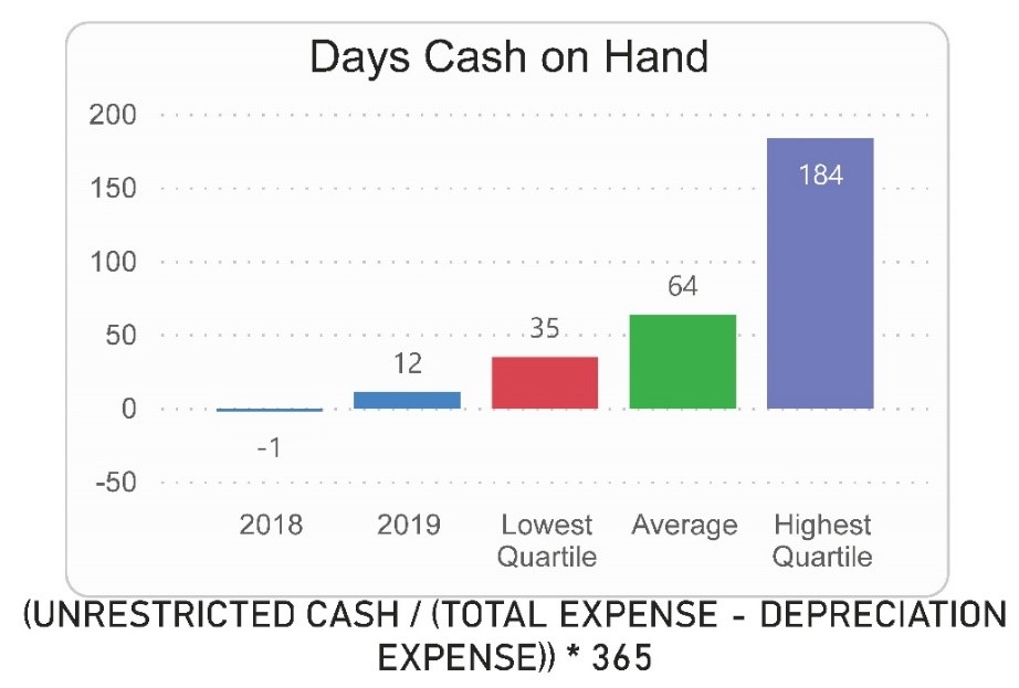
One of our clients was faced with the daunting task of manually compiling financial data for its customers. They were required to create complex formulas in Excel based on clients’ financial data, representing key performance indicators (KPIs) in charts and graphs while also comparing the results to their market competition’s lowest and highest performers. Previously in Excel, this process took weeks to compile the data, check every formula, and pivot the data into charts for each of its respective clients; additionally, there was no solid way to identify the lowest and highest quartiles for competitors in their market and represent it in a visually appealing manner.
The Assessment and Solution
It was clear that Power BI would be the ideal fit—it offers advanced capabilities from a reporting and visualization perspective and the use of functions to maintain complex calculations protects any data integrity issues brought on from manually entering complex calculations directly in Excel. Additionally, Power BI’s columnar refresh capabilities speeds up the timely process of refreshing complex calculations and large datasets.
To address the error prone manual calculations, let’s take a look at an example of how we leveraged Power BI’s custom functions to create a Days Cash On Hand calculation. In layman’s terms, the basic formula we used to calculate Days Cash On Hand is as follows:

We can create the Days Cash On Hand calculation through the use of custom functions in Power BI; the example of Days Cash On Hand Function created in Power BI is shown below:
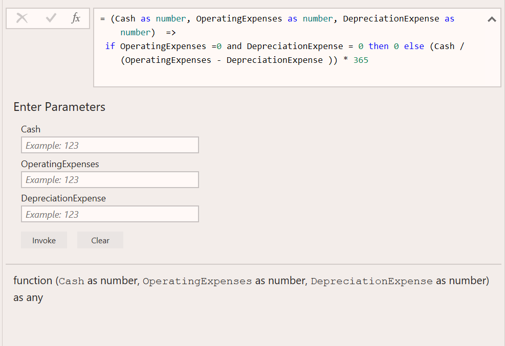
Avoiding manual errors when creating complex functions in Excel, using custom functions in Power BI preserves the integrity of the calculation throughout the entire report refresh process. As shown, variables “Cash”, “OperatingExpenses”, and “DepreciationExpenses” are placeholders for data to be passed into the function which will perform the calculations within the equation box. We passed in financial data from the source into each variable; since we created a fixed formula directly in Power BI, this prevented the manual entry issues that could arise from a keying error if entering the formula directly in Excel. Creating a custom, fixed function saves time and preserves integrity of the calculation when refreshing data regularly.
Now comes the challenge of creating and refreshing visualizations. In Excel, data needed to be manipulated and refreshed to populate a bar chart. In Power BI, you can create a bar chart visualization once and upon updates to your data source, click a refresh button to refresh all contents of the Power BI bar chart.
Lastly, how does one calculate the lowest and highest quartiles (i.e. 25% and 75% rank of competitors) using Power BI? By querying the data source, you can use the powerful M language that comes native with Power BI to perform complex aggregation, transformations, and calculations on your data. As an example, here are formulas (M language) we created on the aforementioned dataset to easily derive quartiles for reporting; the transformations were performed by use of the following steps:


Power BI’s native capability to transform large datasets using simple, easily defined formulas takes the guess work out of performing the same calculations in Excel, cutting down on time and testing before delivering quality reports to your key stakeholders.
[sch_pullbox]While Excel is often the tool of choice when analyzing data and delivering reports to both internal and external stakeholders, it is worth looking into how your organization can leverage Power BI to remove burden and cost-generating hours from the compilation process. Our experience and understanding of optimizing manual reporting processes using industry leading technology and tools not only reduces time spent on non-value add activities, but unlocks that time for analysis and data-driven decisions. If you’d like to further discuss taking manual, Excel-based financial data processes and automating them with Power BI, you can reach out to our Data Analytics team here. [/sch_pullbox]